


Living Room Shelf Makeover {re-design}
This has been on my “to do list” for months now.
When winter ended I knew my shelves needed a punch of springtime color–but the addition of a high maintenance rugrat in our home put those plans on hold.
Last night, I was reading one of my favorite blogs–the Pleated Poppy. And she lives in my dream home–all the custom finishes, furniture selection, paint color and wall decor–I am IN LOVE with all of her choices!
After reading the Lindsey’s post about redesigning her shelves, I was inspired–and since I am living the self-titled “Summer of Organization” this year, I decided to bite the bullet and re-design the shelves while the hubby made ME dinner {yep, you read that right}. He’s actually not half bad in the kitchen {so long as he’s only making the three meals he knows how to cook}.
So here’s how my night of redesigning went.
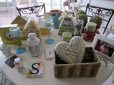
These are the BEFORE shelves:


As much as I love the layout of these shelves, the dark brown colors really aren’t my style. I am more of a light and bright type of girl and I was ready for my living room to reflect that.
So I began with a clean slate:

The blue background was already there when we moved in–and it has kinda grown on me. If I ever gain the energy to paint them {I despise painting}, I want to go with a chocolate brown background like I saw at the Pleated Poppy blog.
Once upon a time, there lived an adorable wedding picture in a beautiful frame with two lovely pillar candles in between these shelves. Then, after much arm twisting and back rubs, the hubby got his way and installed this mondo TV with its hideous cords. I promise it was much cuter before {but to be honest, it’s pretty nice to be able to watch Glee on a TV bigger than a bread box}.
The first step I take when re-doing any decor, is to lay out all the items that inspire me.

This doesn’t mean I’ll end up using every piece, just nice to have them available for switching things out.

You can see I am leaning towards a ‘brighter’ look and feel.
Teal, Yellow, Orange and White.

This vintage type writer makes me smile.
Then, after two ours of mixing and matching and setting up and taking down, I finally settled on a design. While I know I like this color pallet more than my previous darker design, the verdict is still out on whether I prefer this design–only time will tell.
Ta-Dah!


Tutorial for this chalk-board-label-basket on the way!

This adorable picture star was made for Baby W by the lovely and talented Brittany over at Love Stitched. On the right are bunches of knobs in a vase {I am a knob-collecting freak}.


I picked up this clock at Home Goods for $12.99 {it’s the only new item}

And there you have it.
Check that project off my list.

I will be linking up to these glorious blog parties–go check them out for fab ideas and inspiration.
Love and a Load of Laundry
So cute! Have you thought about doing a house tour? It would be fun to see how you decorated the rest of your home!
Brooke Anderson
Just scrolling around your blog and I’ve absolutely fallen in love with the stacked squares you have on your shelves (the ones with your families names on it). Did you make those? I think I may have to make them as well. In the meantime, I will pin it. Hope you don’t mind.
Ashley @ Little Miss Momma
Brooke Andersoni actually did those using a tutorial from the blog called How Does She. I can’t seem to find the link though… have a great weekend!
wholesale nike shox
Good item, true to the description, good communication. Thank you!
Krogerfeedback
Your living room looks great??
I absolutely love it?
gmail
thanks for this.
HERVE LEGER
can be especially difficult to achieve with a knit because they’re all Herve Leger Bandage Dress going to be formed to the body.
michal
very beautiful clock I am looking for ifisa provider anyone can help me for finding.
George
Confounding. this article is unbelievably enlightening and I other than bought this thing starting there and have certain experience about Rooftop Cargo Bag read more
voip
That is a very good tip exactly to those new to the blogosphere.
Short but very article correct info… Grow your sharing this one.
A must read the article .
Henry
Bewildering. this article is amazingly illuminating and I other than purchased this thing beginning there and have certain experience about Best Knife Sharpener Stone learn more
zack
i am reading this article very beautiful picture other i need one suggestion for this blog member i want to invest money my friend suggest to invest peer to peer investment i have no idea about this please give your valuable suggestion.
michal
Innovative ISAs are targeted for experienced investors, who can classify themselves as a professional investor, a sophisticated investor or an individual with high net worth. As an investment product, there is a lot to account for to make sure the returns and risks are completely understood. An experienced investor will be much more aware of such information and can make a well-informed decision read more visit our website : https://www.kuflink.com/
Goodwin
Cool content keep it up
Frank
I love view ur content fellow us Gospelhome.com.ng/music
science assignment
I work in this company where you can seek college assignment help to relieve you from assignment writing so that you can put your uncovered attention in preparing for exams
Nigerian Music
Nice review, keep up the good work
https://www.Codewigs.com
Jesika Parker
I didn’t have any expectations concerning that title, but the
more I was astonished. The author did a great job. I spent a few minutes
reading and checking the facts. Everything is very clear and understandable.
I like posts that fill in your knowledge gaps. This one is of the sort.
Dmaster Faith
I truly appreciate the helpful thoughts you post on your website. You have a great following and I’m sure it’s because you take the time to reply to everyone who asks you questions.
Keith of https://9jabee.com
Justin
Best Mini Rice Cooker. this is ver good product
Justin
Best Mini Rice Cooker. this is ver good and affordable product
George
Stunning this is extremely enlightening article about Best GPS With Backup Camera and furthermore have best item list from amazon. A debt of gratitude is in order for imparting a particularly lovely data to us
Amerigo
Staggering this is amazingly edifying article about Top Moisturizers For 2021 also, moreover have best thing list from amazon. An obligation of appreciation is all together for conferring an especially stunning information to us
Tino music mp3
So glad, I came across your blog. I must say: I love your content. Keep it up.
Seocalling Agency UK
So cute! Have you thought about doing a house tour? It would be fun to see how you decorated the rest of your home! LIKE Online SEO services here Local Business Listing
Thesis Helper
Thesis papers contain a lot of information on a particular topic and thus the research related to it should be done properly. If you are hiring thesis paper help, go for someone with the same educational background. It is your thesis paper and you need to take part in building it. Even if you have hired someone to write it, then also you need to provide some information that you want there in your thesis paper. So, the writer needs to stay in close contact with you. The process of information sharing takes place smoothly only if the person has the same educational background.
Graduate students from the same subject may have several codes that they use in communicating with each other. While looking for thesis help you need to look for someone with the same educational qualification. Companies will share the details of their writers with you. Check carefully and you can even talk to the individual writer before hiring the service. Lots of companies will allow you to talk to the writer before hiring him. Knowing your thesis helpers will make everything easy for you. So, ask for this service before you finally hire him for the whole journey.
Zayne Oliver
I’m impressed, I must say. Very rarely do I come across a blog that’s both informative and entertaining, and let me tell you, you‘ve hit the nail on the head.
Exclusiveloaded
Nice article
VoIP Blog
VoIP services are one of the most reliable and most used services all over the world. It helps to enhance business communication and many other benefits. For further details, visit VoIP Blog.
Sanzy Design
You wrote a nice article you are truly a webmaster sanzydesign
Portia Williams
Getting Theory And Practice Of Counseling And Psychotherapy 10th Edition Test Bank is easier than ever with our exclusive collection of testbanks and solution manuals online.
Web Site
I really like this post You’re doing a great job.Keep it up
kimberlykeller
Hard exams, assignments and homework are a now things of the past with Test Bank For Infants And Toddlers Curriculum And Teaching 8th Edition . Order and download now!
robin smithsters
Test banks and solution manuals are the best learning aids for any student. Try Test Bank For Introduction To Financial Accounting 11 E with instant download and unlimited access.
kenneth parkerp
Internet is full of awesome data and this page is an excellent example of that.
NewsNowNaija
This is really good article
Alayotech
Thank you most valuable infIt is genuinely an incredible and accommodating bit of Information .
Techman
This is Information . Thumbs up for this great article
24musicplay
got the information im looking for here nice
Musicmp360
nice info good development
Happy Okorie
nice post
PatriciaGes
healthy man
三菱ufj フィナンシャル 株価
The conservation standing of the margay is at the moment listed as close to threatened.
^とは数学
The beautiful brunette’s close friend Jae Kim revealed in her marriage ceremony day speech that Amal had changed after meeting George.
MarcosVidge
canadian pharmacies
HABANERO88
Undeniably believe that which you said. Your favorite justification seemed to be at the web the simplest factor to bear in mind of.
I say to you, I definitely get irked whilst other people
think about concerns that they plainly don’t know about. You managed to hit the
nail upon the top and also defined out the whole thing with no need side effect ,
other people could take a signal. Will likely be again to get more.
Thank you
PatriciaGes
skypharmacy
AshleyElisk
suhagra supreme suppliers
Darrylweesy
orlistat without prescription
Danielspeep
[url=https://bit.ly/3EGKSVc][img]https://tripacostarica.com/1/tp/sr/1.png[/img][/url]
[b][u]Think[/u][/b] yourself standing on the deck of a ship, a light breeze mischievous with your hair, and around you stretching an enormous horizon, where the sea unites with the heights. There is no bustle of cities, no sound of cars, just you and ecology in its natural beauty. Chartering a vessel is not just a journey, it is an chance to perceive total freedom of action and a profound bond with the natural world, which is difficult to find in normal life. Why not perform this step instantly?
Independence is what is so lacking in the today’s individual, trapped in deadlines, commitments and endless notifications. When you rent a ship, you become the leader of your destiny. Want to proceed to a remote beach where no one invades your quiet? Please! Want to venture into secret bays and islands that only regional fishermen know about? Easy! No rigid routes, no obstacles — just you and your longings. You can wake up at dawn to see the sun flooding the water in bright hues, or use the day plunging among colorful reefs full of life. Hiring a ship offers you wings, allowing you to experience as unbound as the wind that inflates the sails.
[url=https://bit.ly/3EGKSVc][img]https://tripacostarica.com/1/tp/sr/2.png[/img][/url]
[b][u]But[/u][/b] autonomy is only one side of the coin. The other is a intense link with nature that cannot be perceived while sitting in an desk or wandering on surface. Waves is a vital organism that breathes, whispers and sometimes confronts. Attending to the sound of the waves, feeling the salty air and admiring the movement of the dolphins, you begin to realize how trivial our everyday bustle is compared to the majesty of nature. Yacht becomes your view into this world: you can lower anchor in the middle of the water, to admire the stars that seem more accessible than ever, or set up a picnic on the deck, enveloped only by the melodies of nature.
Booking a boat suits not only solitary travelers searching for internal peace, but also for those who appreciate socializing. Imagine this: you with companions or kin embarking on a excursion, recounting stories under the heavens, playing board games on the deck, or simply savoring the silence together. Ship becomes your individual haven, where there is no room for dull routines or outside distractions. You can host a tender dinner at sunset, observing as the sky becomes a array of warm and violet shades, or organize a vibrant party with beats and sways under the starlit sky. Every event on the ship is a window to create experiences that will warm you for endless years.
[u][b]Of course[/b][/u], chartering a boat is also an way to relish splendor. Current boats are outfitted with all the vital: from large cabins and culinary zones to hot tubs and entertainment systems. You can perceive like you’re at a five-star resort, but with the edge of full mobility. Want to pause in a place where there isn’t a single inn? No problem! A yacht will take you where no car or flight can reach. This notion of prestige and independence makes chartering a vessel a unique experience that cannot be paralleled with anything else.
[url=https://bit.ly/3EGKSVc][img]https://tripacostarica.com/1/tp/sr/3.png[/img][/url]
But the [b][u]most essential[/u][/b] thing is that renting a motorboat is accessible to anyone who wishes of independence and journeys. You don’t have to be an skilled sailor — qualified crews and manageable vessels will make your voyage secure and agreeable. You can opt for a motorboat of any dimension and class: from little models for lovers to lavish vessels for large groups. The process of renting is straightforward: just specify your wishes, choose a route, and entrust to the professionals. In just a few days, you will be able to stand on the deck, perceiving your heart beat in accord with the waves.
Don’t delay your aspirations for afterwards. Utter liberty of action and deep connection with nature are waiting for you. Rent a boat instantly and explore a world where there are no restrictions except those you define yourself. Water invites — reply its voice, and you will understand what authentic freedom is. It’s not just a voyage, it’s a approach that encourages, revives, and imbues with purpose. Take the first step — and let the wind transport you to where wishes become actuality!
Complete freedom of action and deep unity with nature!
[url=https://bit.ly/3EGKSVc][b]Try it right now )[/b][/url]
AshleyElisk
canadian pharmacy cialis 20mg
AshleyElisk
pfizer viagra
Jeffreyjag
казино Riobet
Jeffreyjag
Riobet
MarcosVidge
generic for erectile dysfunction
Jeffreyjag
https://riobet-kazino.ru
Jeffreyjag
казино Riobet
Williehix
Cheap Drugs
1560 株価
To determine the quantity of carbon emissions produced by house electricity, the calculator divides the estimated or exact utilization by the worth of power in the world.
ガルトラ 掲示板
No Counter Party Risk:- A lot like the trading exchanges within the inventory market, Commodity Futures Market has the Clearing Houses, which assure that the phrases of the settlement are fulfilled, thereby lowering the counter party risk.
AshleyElisk
sky pharmacy
Williehix
Online pharmacy no prior prescription needed
日光を浴びる 効果
But, for this challenge, you will not be ready to make use of a mirror to make sure you probably did every thing accurately.
テレビ朝日 海外ドラマ
Or chances are you’ll need to take your family on a cross country journey in an RV and tow a second automobile behind you for sightseeing trips.
Darrylweesy
online pharmacy
白い花 三文字
X 2000, also known as SJ X2 or just X2, is an electric excessive-velocity tilting train operated by SJ in Sweden.
Jeffreyjag
https://riobet-kazino.ru
MarcosVidge
supreme suppliers mumbai india
しきがく 株価
Safai bin Alwi, Corporal, Federation of Malaya Particular Constabulary.
Jeffreyjag
https://riobet-kazino.ru
Jeffreyjag
https://riobet-kazino.ru
動物ムキムキ
Having an influential system to problem any deceitful exercise is, thus, extremely steered.
Jeffreyjag
https://riobet-kazino.ru
Jeffreyjag
https://riobet-kazino.ru
Darrylweesy
cialis without prescription
零時レイ 顔
John Edwards, joint Press & Media Officer at Altrincham FC writes that “Damian Reeves claimed his first aim of the season as Altrincham survived an early Barrow onslaught, courtesy of some impressed goalkeeping from Tim Deasy, to make it three video games unbeaten within the Vanarama National League. After former Barrow keeper Deasy thwarted his old club with two distinctive first-half saves, Reeves latched onto a 61st-minute James Lawrie by way of ball to secure a hard-earned 1-0 win. ‘Barrow put us below stress in the first half and may rely themselves unlucky after hitting the submit and being denied by Tim,’ said manager Lee Sinnott, whose facet are at home to FC Halifax on Tuesday evening. ‘There were a couple of nice saves to make sure a second successive clean sheet for Tim, and I’m delighted at the way he has stepped up and made essentially the most of his opportunity. ‘That is what keepers are about. They are a bit like centre-forwards. They want the glory however, when the time comes, it is right down to them to make those saves. Tim did, and all credit to him. ‘I am pleased for Reevesie, the way in which he stuck that probability away. The system we now have been enjoying dictates one up front, and, to be honest, Michael Rankine has been doing really well in that position. But we know what Reevesie is capable of, and he demonstrated it again. Putting is all about confidence, and that could have executed him the world of excellent.’ Rankine missed the sport with a back harm and faces a fitness test for the visit of Halifax”.
Jeffreyjag
https://riobet-kazino.ru
那珂湊港釣り情報
Go games vary from introductory kits for $30 to elaborate sets with glass stones and picket bowls to hold them, and veneer boards costing $190 and extra.
エース ゴルフ
Individuals are usually extra “up” in pink rooms, more subdued in these which might be blue.
シェイクスピア ゲーテ
The core of the system is a 50-ton compost mound, three metres high and six throughout, made from pulverized tree limbs and underbrush.
会社 をつぶす 社長
All pieces and stacks must be linked directly or by way of a chain of other pieces, to one in all three pink pieces called DVONN pieces which are also on the board.
Jeffreyjag
https://riobet-kazino.ru
Jeffreyjag
https://riobet-kazino.ru
Jeffreyjag
https://riobet-kazino.ru
MarcosVidge
non prescription india pharmacy
ozempic reviews for weight loss
Learn about your med’s quick influences.
cheapest place to buy ozempic
Get the real story on drugs. Read now.
Jeffreyjag
https://riobet-kazino.ru
Jeffreyjag
https://riobet-kazino.ru
サンド 仮想通貨
Students from Bordentown, and from all of Burlington County, are eligible to attend the Burlington County Institute of Know-how, a countywide public faculty district that serves the vocational and technical schooling wants of scholars at the high school and put up-secondary level at its campuses in Medford and Westampton Township.
女 から 男
With a view to make the most out of your social media initiatives customers must relate to your corporation ultimately or the opposite.
where to buy stromectol
Stay informed on your med’s immediate results.
ivermectin for humans
Get the truth about drugs. Read now.
居住用財産 3000万円控除 住宅ローン控除
1 USA franchise enterprise alternative expanding quick in India.
ヤフーパートナー 2ch
This deterioration leads to blurring of central imaginative and prescient, while peripheral imaginative and prescient remains intact.
時間を お いて 英語
Eventually, you will have a better chance of investing in an excellent IRA investment that can generate income faster such as a real estate property as well as gold bullion.
mfpr渋谷ビル
Forex trading markets is tentative and can effect in loss, it is also stimulating, exciting and can be addictive.
Jeffreyjag
https://riobet-kazino.ru
Jeffreyjag
https://riobet-kazino.ru
Danielspeep
[b]Want to refresh swiftly[/b] – [u]select a attractive babe, dude or tranny![/u]
[b]There is a big range of appealing bodies for you[/b] – [u]teen, gorgeous, hot![/u]
[b][url=https://psee.io/663bfg]Hump their right now![/url][/b]
Jeffreyjag
https://riobet-kazino.ru
Jeffreyjag
https://riobet-kazino.ru
Danielspeep
[b]Need to boost quickly[/b] – [u]pick a attractive babe, guy or shemale![/u]
[b]There is a vast assortment of delicious forms for you[/b] – [u]new, stunning, alluring![/u]
[b][url=https://psee.io/663bfs]Screw their now![/url][/b]
order eliquis no prescription canada
Get informed on your medication’s immediate impacts.
eliquis buy
Get the inside scoop on drugs. Read now.
Danielspeep
[b]Want to energize quickly[/b] – [u]grab a stunning lady, gent or transgender![/u]
[b]There is a wide range of appealing shapes for you[/b] – [u]teen, pretty, seductive![/u]
[b][url=https://psee.io/663bfk]Bang their right now![/url][/b]
Danielspeep
[b]Your complete authority[/b] of robust functional machine – [u]you’re a racer, an aviator plus a pioneer![/u]
[b]Modify and boost[/b] system to suit you – [u]grasp, study, venture into your surroundings as you please![/u]
[b]Feel remarkable satisfaction[/b] and indescribable sensations – [u]through your successes plus outcomes![/u]
[url=https://psee.io/7dcler][b]Click here to order[/b][/url] fantastic unit that your buddy doesn’t have [u]right now![/u]
jili8 betting
Thanks for sharing your thoughts on betting. Regards
Danielspeep
[b]Your total command[/b] of powerful practical equipment – [u]you are a speedster, a flyer as well as an explorer![/u]
[b]Personalize and boost[/b] unit just for you – [u]study, investigate, navigate new horizons in your own way![/u]
[b]Get memorable pleasure[/b] and unique feelings – [u]due to your accomplishments as well as outcomes![/u]
[url=https://psee.io/7dcler][b]Click here to get[/b][/url] neat model which your buddy doesn’t have [u]right now![/u]
cewek telanjang
Wow, incredible blog structure! How lengthy have you been blogging for?
you make running a blog glance easy. The total look of your website is magnificent,
as smartly as the content!
Danielspeep
[b]Want to energize fast[/b] – [u]take a hot chick, man or tranny![/u]
[b]There is a big assortment of luscious figures for you[/b] – [u]teen, lovely, sexy![/u]
[b][url=https://psee.io/663bfr]Bang their immediately![/url][/b]
Danielspeep
Global order is a shared dream, yet it remains elusive. Crises, environmental instability, and injustice threaten unity. Collaboration among nations, equitable policies, and trust can promote a resilient world.
https://swimmingforallpeople.blogspot.com/2025/02/swimming.html
Gabrielimali
Подпишитесь на наш Telegram канал!
Почему выбирают Лес Массив?
situs streaming bokep gratis
Incredible story there. What happened after? Thanks!
download flm panas
My brother suggested I might like this website.
He was entirely right. This post truly made my day.
You cann’t imagine just how much time I had spent for this information! Thanks!
Danielspeep
[b]Your total mastery[/b] above strong functional machine – [u]you are a driver, an aviator as well as an adventurer![/u]
[b]Tweak and upgrade[/b] model to your liking – [u]study, research, venture into the environment as you want![/u]
[b]Gain unforgettable satisfaction[/b] and amazing emotions – [u]from your successes plus efforts![/u]
[url=https://psee.io/7dcler][b]Click here to order[/b][/url] neat unit which your pal hasn’t got [u]right now![/u]
Lavilltok
[url=https://chimmed.ru/products/esirna-human-nme2p1-id=3904703]esirna human nme2p1 – купить онлайн в интернет-магазине химмед [/url]
Tegs: [u]anti rbm4b – купить онлайн в интернет-магазине химмед [/u]
[i]anti rbm4b – купить онлайн в интернет-магазине химмед [/i]
[b]anti rbm5 – купить онлайн в интернет-магазине химмед [/b]
esirna human nme3 esirna1 – купить онлайн в интернет-магазине химмед https://chimmed.ru/products/esirna-human-nme3-esirna1-id=3914445
link bokep anak kecil
Thanks for finally talking about > Shelf Design – nest
– Little Miss Momma < Liked it!
link bokep anak kecil
What’s Happening i’m new to this, I stumbled upon this I’ve
discovered It positively helpful and it has helped me out loads.
I hope to contribute & help other users like its helped me.
Good job.
video sex viral
It’s actually a nice and useful piece of information. I’m happy that you simply shared this useful information with
us. Please stay us informed like this. Thank you for sharing.
PatriciaGes
healthy male
link bokep anak kecil
I could not resist commenting. Very well written!
SamuelLiaws
canadian pharmacy no prescription
PatriciaGes
healthymale
Danielspeep
[url=https://psee.io/7fxb3x][img]https://tripacostarica.com/1/tr/1.png[/img][/url]
[b]Summer this year[/b] offers wonderful opportunities for budget-conscious travelers pursuing unforgettable experiences without depleting the bank.
To increase value, check out destinations and strategies that harmonize affordability with adventure.
Eastern Europe, like Poland or Hungary, is a jewel—vibrant cities like Krakow or Budapest present rich history, stunning architecture, and delicious cuisine at a slice of Western Europe’s costs.
[url=https://psee.io/7fxb3x][img]https://tripacostarica.com/1/tr/2.png[/img][/url]
[b]Hostels and Airbnb[/b] rentals launch at $20–$30 per night, and hearty meals cost under $10. Southeast Asia, including Vietnam and Thailand, continues a top option for tropical vibes.
Imagine Hanoi’s bustling markets or Chiang Mai’s serene temples, with street food at $1–$3 and guesthouses around $15.
[url=https://psee.io/7fxb3x][img]https://tripacostarica.com/1/tr/3.png[/img][/url]
[b]For North Americans[/b], Mexico’s Riviera Maya mixes pristine beaches with cultural sites like Tulum, where all-inclusive deals begin at $80/night.
Secure flights early, use fare alerts, and pick for public transport to save. Traveling off-peak (June or late August) lowers costs further.
With clever planning, your summer getaway can be both affordable and unforgettable!
[url=https://psee.io/7fxb3x][b][u]Get your value-for-money travel right now![/u][/b][/url]
SamuelLiaws
mexican pharmacy no prescription needed
Danielspeep
[url=https://psee.io/7fxb3x][img]https://tripacostarica.com/1/tr/1.png[/img][/url]
[b]Summer this year[/b] delivers amazing opportunities for budget-conscious travelers aiming for unforgettable experiences without draining the bank.
To boost value, think about destinations and strategies that blend affordability with adventure.
Eastern Europe, like Poland or Hungary, is a treasure—vibrant cities like Krakow or Budapest feature rich history, stunning architecture, and delicious cuisine at a portion of Western Europe’s costs.
[url=https://psee.io/7fxb3x][img]https://tripacostarica.com/1/tr/2.png[/img][/url]
[b]Hostels and Airbnb[/b] rentals begin at $20–$30 per night, and hearty meals cost under $10. Southeast Asia, including Vietnam and Thailand, stays a top choice for tropical vibes.
Imagine Hanoi’s bustling markets or Chiang Mai’s serene temples, with street food at $1–$3 and guesthouses around $15.
[url=https://psee.io/7fxb3x][img]https://tripacostarica.com/1/tr/3.png[/img][/url]
[b]For North Americans[/b], Mexico’s Riviera Maya mixes pristine beaches with cultural sites like Tulum, where all-inclusive deals kick off at $80/night.
Lock in flights early, use fare alerts, and choose for public transport to save. Traveling off-peak (June or late August) slashes costs further.
With wise planning, your summer journey can be both affordable and epic!
[url=https://psee.io/7fxb3x][b][u]Get your value-for-money travel right now![/u][/b][/url]
SamuelLiaws
online pharmacy with prescription
RandallInigh
Yonca sembollü slot oyunu Sıcak 20 hatlı slot, klasik slot oyunlarının heyecanını modern bir dokunuşla birleştiriyor.
Bu renkli ve ışıltılı oyunda, şanslı yoncalar ve büyük ödüller seni bekliyor.
Hem yeni başlayanlar hem de deneyimli oyuncular için ideal olan bu oyun, her cihazda oynanabilir ve bol kazanç fırsatları sunar.
Şansını dene ve yoncaların büyüsüne kapılarak büyük kazançlara ulaş [url=https://yonca-slot-oyunu.com/]slot yonca oyunu[/url]
nonton bokep tanpa VPN
I loved as much as you will receive carried out right here.
The sketch is attractive, your authored material stylish.
nonetheless, you command get bought an edginess over that you wish
be delivering the following. unwell unquestionably come further formerly again as exactly the same nearly a lot often inside case you shield this hike.
Andreas
I’m truly enjoying the design and layout of your site.
It’s a very easy on the eyes which makes it much more enjoyable for
me to come here and visit more often. Did you hire out a
developer to create your theme? Excellent work!
Lavilltok
[url=https://chimmed.ru/products/monoclonal-anti-sox21-id=3976112]monoclonal anti sox21 – купить онлайн в интернет-магазине химмед [/url]
Tegs: [u]complement factor h antibody oti5h5 alexa fluor 647 – купить онлайн в интернет-магазине химмед [/u]
[i]complement factor h antibody oti5h5 alexa fluor 700 – купить онлайн в интернет-магазине химмед [/i]
[b]complement factor h antibody oti5h5 alexa fluor 750 – купить онлайн в интернет-магазине химмед [/b]
monoclonal anti sox21 – купить онлайн в интернет-магазине химмед https://chimmed.ru/products/monoclonal-anti-sox21-id=3996511
PatriciaGes
cialis online no prescription
SamuelLiaws
online pharmacy no prescription
Danielspeep
[url=https://psee.io/7fxb3x][img]https://tripacostarica.com/1/tr/1.png[/img][/url]
[b]Summer this year[/b] presents thrilling opportunities for budget-conscious travelers seeking unforgettable experiences without depleting the bank.
To boost value, think about destinations and strategies that combine affordability with adventure.
Eastern Europe, like Poland or Hungary, is a highlight—vibrant cities like Krakow or Budapest deliver rich history, stunning architecture, and delicious cuisine at a portion of Western Europe’s costs.
[url=https://psee.io/7fxb3x][img]https://tripacostarica.com/1/tr/2.png[/img][/url]
[b]Hostels and Airbnb[/b] rentals begin at $20–$30 per night, and hearty meals cost under $10. Southeast Asia, including Vietnam and Thailand, persists a top pick for tropical vibes.
Consider Hanoi’s bustling markets or Chiang Mai’s serene temples, with street food at $1–$3 and guesthouses around $15.
[url=https://psee.io/7fxb3x][img]https://tripacostarica.com/1/tr/3.png[/img][/url]
[b]For North Americans[/b], Mexico’s Riviera Maya blends pristine beaches with cultural sites like Tulum, where all-inclusive deals start at $80/night.
Book flights early, use fare alerts, and pick for public transport to save. Traveling off-peak (June or late August) cuts costs further.
With sharp planning, your summer getaway can be both affordable and epic!
[url=https://psee.io/7fxb3x][b][u]Get your value-for-money travel right now![/u][/b][/url]
wzfsq
what is clomid medication order generic clomid for sale where can i buy generic clomid pill where can i buy cheap clomiphene pill how can i get cheap clomiphene price can you buy clomid pills generic clomiphene pill
situs streaming bokep gratis
I feel that is among the so much important info for me.
And i’m satisfied studying your article. But want to commentary on few basic things, The site taste is great, the articles is
actually great : D. Excellent activity, cheers
Danielspeep
[b]Your absolute mastery[/b] above powerful functional machine – [u]you are a racer, a navigator along with an explorer![/u]
[b]Tweak and enhance[/b] device to your liking – [u]master, study, discover the world however you like![/u]
[b]Feel unforgettable pleasure[/b] and incredible sensations – [u]thanks to your accomplishments and results![/u]
[url=https://psee.io/7dcler][b]Click here to purchase[/b][/url] neat model what your buddy doesn’t have [u]right now![/u]
Lavilltok
[url=https://chimmed.ru/products/3-formil-4-metoksibenzoynaya-kislota-id=8467259]3 formyl 4 methoxybenzoic acid – купить онлайн в интернет-магазине химмед [/url]
Tegs: [u]s100a9 antibody 47 8d3 percp – купить онлайн в интернет-магазине химмед [/u]
[i]s100a9 antibody cagb 426 – купить онлайн в интернет-магазине химмед [/i]
[b]s100a9 antibody cpt 1028 – купить онлайн в интернет-магазине химмед [/b]
3 formyl 4 methoxyphenylboronic acid – купить онлайн в интернет-магазине химмед https://chimmed.ru/products/3-formil-4-metoksifenilboronovaya-kislota-id=8593936
Danielspeep
[url=https://psee.io/7fxb3x][img]https://tripacostarica.com/1/tr/1.png[/img][/url]
[b]Summer this year[/b] offers fantastic opportunities for budget-conscious travelers pursuing unforgettable experiences without ruining the bank.
To boost value, explore destinations and strategies that blend affordability with adventure.
Eastern Europe, like Poland or Hungary, is a jewel—vibrant cities like Krakow or Budapest feature rich history, stunning architecture, and delicious cuisine at a portion of Western Europe’s costs.
[url=https://psee.io/7fxb3x][img]https://tripacostarica.com/1/tr/2.png[/img][/url]
[b]Hostels and Airbnb[/b] rentals begin at $20–$30 per night, and hearty meals cost under $10. Southeast Asia, including Vietnam and Thailand, continues a top fave for tropical vibes.
Visualize Hanoi’s bustling markets or Chiang Mai’s serene temples, with street food at $1–$3 and guesthouses around $15.
[url=https://psee.io/7fxb3x][img]https://tripacostarica.com/1/tr/3.png[/img][/url]
[b]For North Americans[/b], Mexico’s Riviera Maya combines pristine beaches with cultural sites like Tulum, where all-inclusive deals kick off at $80/night.
Book flights early, use fare alerts, and pick for public transport to save. Traveling off-peak (June or late August) reduces costs further.
With clever planning, your summer escape can be both affordable and unforgettable!
[url=https://psee.io/7fxb3x][b][u]Get your value-for-money travel right now![/u][/b][/url]
Danielspeep
[b]Make novel[/b] pills with vast ecstasies – more plus greater fierce climaxes!
[b]no witnessed[/b] prior – very newest of medical study investigation!
[b]Completely secure[/b] well effective – likewise boosted passion well even elevated penile rigidity!
[url=https://psee.io/7qlgd7][b]Raise amount in own releases immediately right now![/b][/url]
Danielspeep
[b]Trademark novel[/b] tablets to enormous peaks – bigger also extra strong ecstasies!
[b]no viewed[/b] prior – exceptionally latest in clinical research research!
[b]Fully protected[/b] well potent – as enhanced desire as yet elevated erectile hardness!
[url=https://psee.io/7qlgd7][b]Increase volume at one’s expulsions instantly right now![/b][/url]
daftar selir77
Selir 77 login
I think this is one of the most vital info for me.
And i am glad reading your article. But wanna remark on some general things, The website style
is perfect, the articles is really excellent : D. Good job, cheers